Linkedin Learning: Power BI Essential Training (2022)
Power BI Essential Training (2022)
Get a competitive edge in business analysis with Power BI
Get a competitive edge in business analysis with Power BI
Microsoft's Power BI can give you a competitive advantage in business analysis. This powerful set of tools lets you analyze data and create visualizations that you can edit, manipulate, publish, and share with your colleagues. Learning Power BI gives you an edge over people who are trying to analyze data using tools that are harder to use, less powerful and less collaborative. I'm Gini von Courter and I specialize in helping skilled users move out of their comfort zones to step boldly into new applications or platforms. In this course, we'll explore using Power BI to make a positive impact for you, your career, your team, and your organization. Over 600,000 LinkedIn learning members have taken this course. I'm delighted you're ready to join them, and by the end of this course, you will be too.
What you need for this course
What you need for this course
In this course, we're going to start out with a Power BI service and then move to Power BI Desktop. This is what you will need if you want to work along with me, which I highly recommend. Let's talk first about hardware. Microsoft recommends two gigabytes of available RAM in order to run Power BI Desktop and four gigabytes or more is recommended. I would tell you that even more than this is better. If I'm running Power BI and trying to analyze even relatively simple datasets with only two gigabytes of available RAM, it's an underwhelming experience. I'm currently running a machine with 32 gigabytes of RAM, primarily because of Power BI. Your CPU, one gigahertz or faster with a 64 bit processor, and again, the faster the better. Although with a three gigahertz processor, I am rarely waiting while I'm using Power BI. Display settings are something that most of us adjust once with a new PC and then we ignore it. But with Power BI, you'll want to be attentive because if you set your display incorrectly, Power BI will still show a full window, it's just that some of it will be off the screen. So you'll need to have a display of 1440 by 900, or if you're in 16 by nine orientation, 1600 by 900.
In a similar vein, you'll want to make sure that your text display is set for a hundred percent or less. It's really common now for folks to set their display high and then set the text at a higher percentage, 125 or 150. But if you do that, you'll have problems with Power BI. The bottom line, be attentive to your display with Power BI, even if you haven't had to be with any other software you've installed. Regarding software, Power BI is meant to run on Windows 8.1 or Windows Server 2012 R2 or later. Most of us will probably run it on Windows 10 or 11. The change here is that Windows 7 is no longer supported for Power BI use. You'll also need .NET 4.6.2 or later and the latest version of the browser that you're using, perhaps Internet Explorer 11, or my favorite, Microsoft Edge. There are three different ways Power BI is licensed. Power BI itself is the free version, and that version will allow you to do about 75% of what I'll show you in the course.
To work along with all the demos, you'll want Power BI Pro, which has a monthly license associated with it. However, don't despair yet. It might already be included with the version of Office 365 that you're using. And if you don't have Power BI Pro, you can get a time-limited trial of Power BI Pro for free at powerbi.com, which I'm going to show you in a couple of movies from now. - In addition to Power BI Pro or perhaps Power BI Premium, we'll also be using Power BI Desktop, which is a free download that allows you to model and transform data. And additionally, there are some apps for Power BI for mobile devices, and if you have a mobile device and want to work along, you'll probably download and install an app there as well.
How about your data skills? I assume that you know something about how to work with data because Power BI is all about visualizing data so you can share those visualizations with others. For example, if you are working in Excel and you know how to enter, edit and format text and numbers, you know how to use the table commands, how to find and replace and sort and filter data, and how to insert and format charts, you will do well here in Power BI because those are exactly the kind of skills you'll want to bring to this party.
If you're not an experienced spreadsheet user and you would like a refresher on any of this, I would heartily recommend Oz du Soleil's course, Excel: Managing and Analyzing Data, which you'll find in the LinkedIn Learning Library. So if you'd like to buff up, feel free to go visit Oz, then come back here to me and we'll continue with Power BI. One more thought. This course will teach you how to create reports and dashboards in Microsoft Power BI. If you work in an organization where you are already receiving reports and dashboards that you need to be able to use immediately, not to create new ones, but to use the ones that already exist, then you might consider starting your Power BI training with Getting Started with Power BI, a consumer's course for end users, and you'll find this in the LinkedIn Learning library.
Overview: Power BI concepts
Overview: Power BI concepts
Business intelligence is about connecting business decision making to facts about the business and about its environment, to take a deep dive and understand the data underneath your business and its processes. We start by getting data from one or more sources. If we have multiple sources of data that we're tying together, we need to build a model that describes the relationships between the data sources. Using our model of the data, we will create visualizations, charts, tables, and so on that we can share with our colleagues. And with all of this information summarize and illustrated in a way that is accessible and useful, our team or our department or organization will be able to make better business decisions.
Until recently, business intelligence meant big business, what was called Enterprise BI, and the players were big players, SAP and Oracle, IBM, Microsoft, and so on, large companies creating really large tools. And Enterprise BI was the realm of the IT professional more than any other group. That meant that IT folks and IT resources were required to analyze what was needed in the business so that IT could retrieve exactly the correct data to create the reports that end users and business managers were requesting.
The first solid alternative to this type of enterprise business intelligence was Microsoft Excel because Excel allowed users to analyze data for themselves, even if they had to get the data from IT, even if they had to use last month's downloaded data. Excel is a popular business tool precisely because so many people learned Excel to be able to get a better handle on their business, on the data for their products, their departments, their companies. For many of us, Excel was our first step into self-serve business intelligence. The current version of Power BI was built almost totally in Excel and with add-ins for Excel. Microsoft, however, has continued to evolve Power BI and it now has a set of tools that are not Excel-centric.
Before we begin then, let's have some core understanding of what it is we do with Power BI. First, we will create datasets, the models I referred to a moment ago, which could be data all from one source or from multiple sources. We will use those data sets to create reports. And don't simply think of rows and rows of figures with labels. Reports in Power BI are vibrant with funnel charts, tree maps, geospatial maps, dozens of types of visualizations. These reports aren't necessarily meant to be shared directly. If we want to share the information in our reports, we'll take parts of the reports, some of the visualizations, and create dashboards, and this is very easy to do.
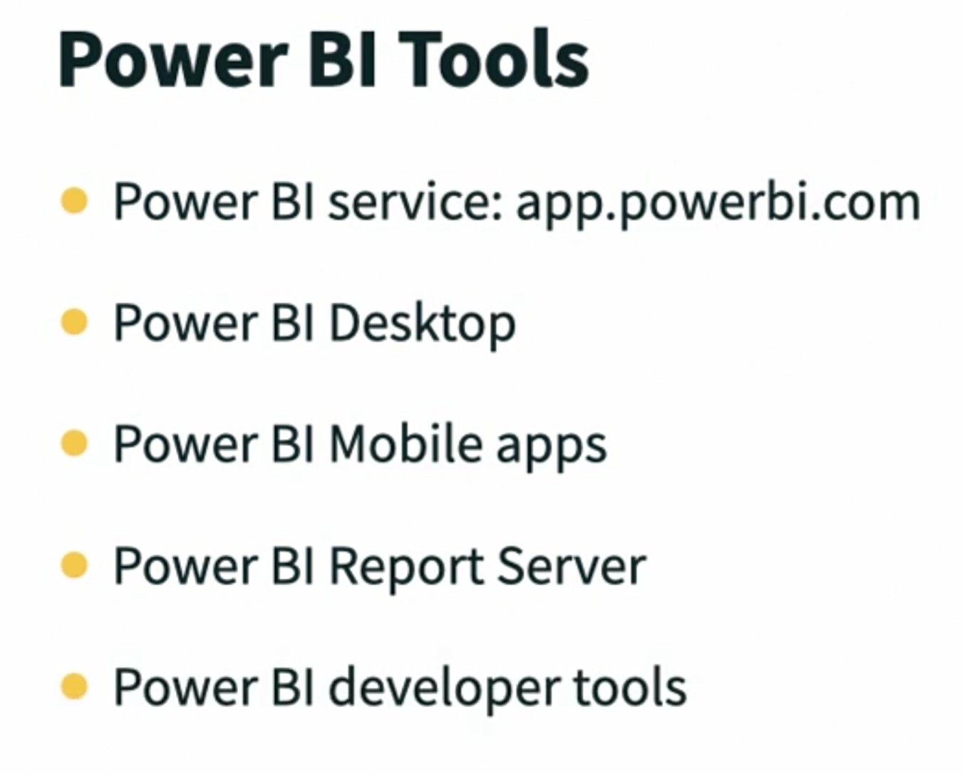
Power BI is not just one product. We have a number of tools and we will focus on a few of them in this course. First, the Power BI service, also called powerbi.com, or what most people mean when they say Power BI. It's web-based, and for many users, this is the only tool they use because the Power BI service allows users to manipulate visualizations to do a deeper analysis of business information. If you are an end user, you may spend almost your entire time in Power BI in the Power BI service, but if you are a business analyst or a power user, then you will probably also use Power BI Desktop, a free download that sits on your Windows computer and allows you to do the things that we previously did only in Excel to model our data, to transform our data, and also we can create reports here that we publish to the Power BI service.
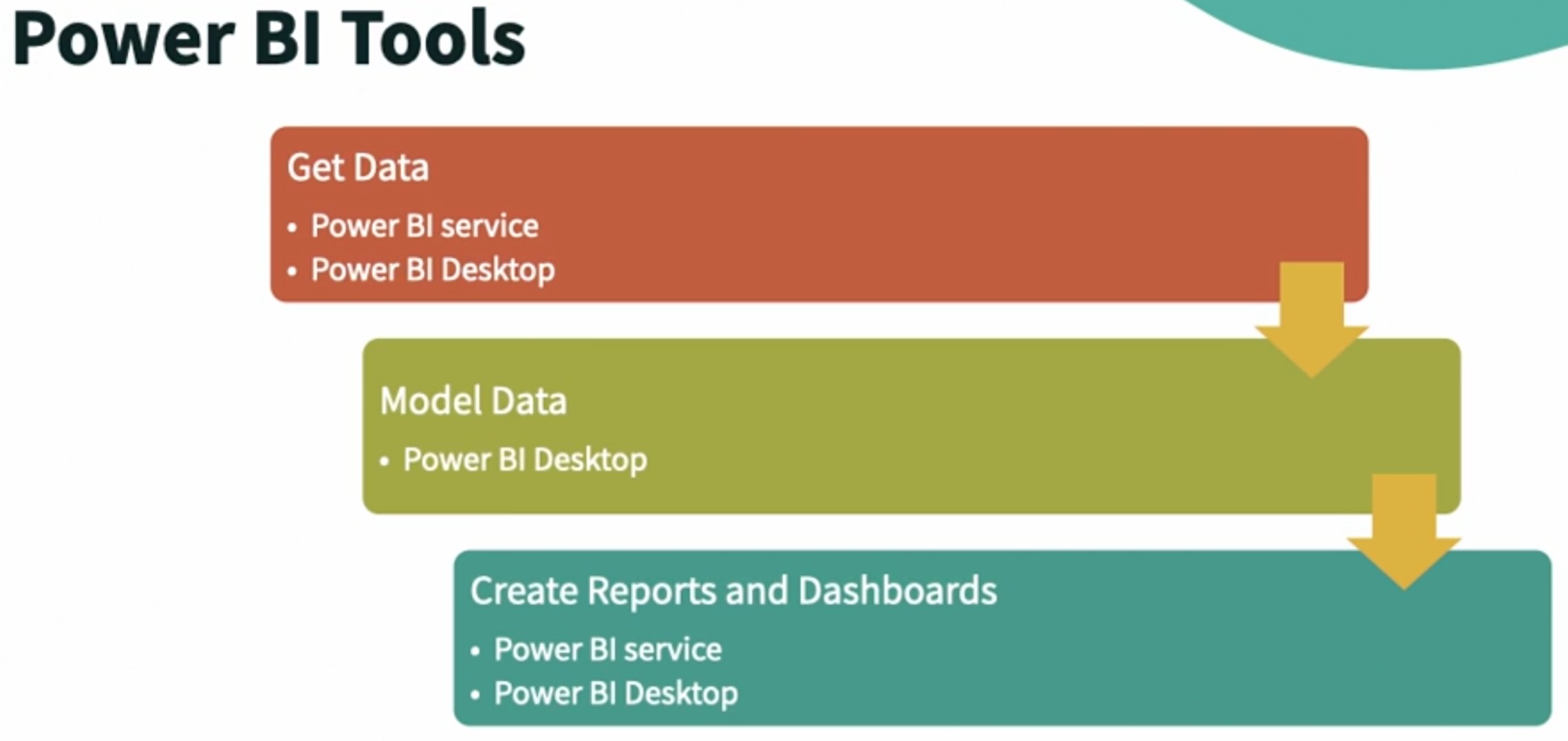
Additionally, there are mobile apps for Power BI for iOS and Android. There are some other components in the Power BI ecosystem that we will not focus on at all in this course, including a visuals marketplace where you can download custom visuals, a Power BI gateway used to synchronize data coming into Power BI from enterprise systems on-premises. Power BI Report Server is used in the place of Power BI service for companies that don't have their data stored in the cloud. Finally, there is a growing set of developer tools for Power BI. You may recall that there are three major licenses for Power BI: Power BI, which is free, Power BI Pro, and Power BI Premium. Regardless of the license that we use, we're going to use the tools in Power BI in what will become a familiar pattern. We're going to get data using either the Power BI service or Power BI Desktop. And if we need to build data models, we will do that exclusively in Power BI Desktop. We'll create visualizations and use them to create reports and dashboards, and then we will share them with our teams using either the Power BI service or Power BI mobile apps.
Sign up for Power BI
Sign up for Power BI
In this video, I'm going to show you how to sign up for Power BI. If you already are licensed and signed up, just bear with me and hang out while the rest of us do this. We're going to go to either powerbi.com or powerbi.microsoft.com. They both resolve to the same page. There's a buy now and a try free button here, and a start free button. But ignore them please. What I'd like you to do is click the products link and then slide down to Power BI Pro. That will take you to this page. And this try free is a link to sign up for a free subscription to Power BI Pro. So click try free. And here you're asked to enter your email so that Microsoft can check and see if you need to create a new account. There's some information below the fine print that talks about using your organization's email. But here's the executive summary.
There's a requirement here that you must enter a work or organizational email address .com, .edu, dot your company's name and my instance kinetico.info, not Gmail, not live.com, not an email address from your internet provider, even if that's the type of email address your organization uses. So I'm going to enter what is clearly not an organizational email address and click submit. And when I do, I'm taken to the signup page, but I'm told this looks like a personal email address. Enter your work email address so we can connect you with others in your company. And that's true even if you are the first person in your company to do this. So you must enter a work address in order to get past this point. What if you don't have an organizational email address? What if you are between organizational email addresses? In that case, there is a workaround. You can use your personal email address, your non organizational email address to get a trial subscription to Microsoft 365, and then use that account, which will have an on microsoft.com as part of its extension to sign up for a trial for Power BI.
To do that, you can either pause the video and write down this URL, which is the current URL at Microsoft for a Microsoft 365 business standard one month trial. If that moves or you don't want to keep track of that much, you can also search for the phrase Microsoft 365 Business Standard one month trial. And even with that, you'll usually have to scroll down a little bit in your searching engine in order to find the page that is actually on Microsoft rather than an ad. But if you sign up for this trial, you will have access not just to one or two, but up to 25 user accounts each with its own email. Each of them can be used to sign up for Power BI. So after I come back here and sign in with a work email address like this one, which is my email address, then I'm going to click next. Microsoft will check and will note that I'm already a Microsoft customer, that I can sign in and then I can get Microsoft Power BI with my account. Even though I have a Power BI account. At this point, I'm being prompted to log in so there's some authentication to prove who I am. And when you're all done signing up, which may include creating an account and confirming through your email, then you'll be able to log in. So I'm going to sign in. Here we click Get Started, and we are taken immediately to Power BI. If you already have a license and an account for Power BI, you can just log into Office 365 SharePoint teams admin. Click the waffle and choose Power BI. And again, it will load the homepage of the Power BI Service.
Navigating in the Power BI service
Navigating in the Power BI service
About a month after this course had been rerecorded and published into the LinkedIn Learning library, Microsoft changed the way we get data, which also changed the user interface for the millions of Power BI users. This is the joy and sorrow of web-based software. It can be improved all the time and it's often improved with no advance notice. This movie and the movies in the next chapter titled Get Data are all new so that you can see how this new user interface works, and more importantly, how we get data using the new UI. After that, we'll return to the movies that I'd recorded previously and you'll see a little bit of a shift in there, and that's okay, because the UI that you see on your screen may already be different than mine. Microsoft updates Power BI sometimes as often as twice a week, but here we are logged into the Power BI service and we're going to take a quick tour. At the top, upper left hand corner, we have the Microsoft 365 waffle. Over to the right, Search, which is search for all of Power BI, if we're looking for a particular item we've created or have loaded. To the right then, the Settings menu, which allows us to change settings for Power BI and to download other applications in the Power BI family. And then finally, when you click on your profile, you can see your licensing type. If you're running a trial, you can see how many days you have left, and you can sign out of your account, which you might want to do if you were using Power BI in a public location. Returning to the left, we have a navigation pane. This is Home, Create, Browse, which allows us to browse through the items that we already have, Data hub, which shows us just our data sets, Metrics, which is beyond the scope of this course, but which allows you to view metrics on how applications are being used, Apps, which is where we load new applications from, and I'll show you how to do that shortly, Deployment pipelines, which are used to deploy Power BI solutions, also beyond the scope of this course, and then some information from Microsoft Learn on using Power BI, and Workspaces. We have multiple workspaces available. I have my workspace, which is also repeated directly below it, so my workspace is one of the workspaces, but there are other workspaces as well. I have a consumer catalog request workspace, a DAX workspace, and I can create a new workspace here, if I wish. In the center then of the screen, all of the rest of what we have. At the top, recommended items, and these may be strong recommendations from your organization. For example, the first time you log into Power BI, you might see four applications that they recommend, because they believe that people in your role, in your work might use those or they're the most popular applications in your organization. As you scroll down, you'll see a list of different objects in Power BI. So when we see this stack of cards that looks like the workspace icon, this is a workspace. This column chart icon is a report. The gauge icon is for a dashboard. The icon that looks just like the apps icon here is indicating that this is an app. And then finally, if you see the drum, which stands for data in flow charting, then that's a data set that you can use inside of Power BI. These are the items I've used most recently. If you click Favorites, then you'll see items that you have curated or favorited, and I'll show you that later in the course. And then finally, My apps are apps that you have loaded or possibly apps that you have created. If I click on My workspace in the lower left hand corner, I also have a filter here. This is everything in my workspace. This is content, and content means not data sets. And then, data sets and data flows so that you can separately look for individual items, but know that you have a search box right here that will allow you to search in My workspace or any other workspace that you may have open. Here we have lots of dashboards and reports and this is sortable. Each of these headers can be used so that you can sort by owner, you can sort by name. So you can browse here, but you can also search. Let's return to home by clicking the Home button in the navigation pane. And a reminder that, if you're working on a public computer, it's always a good idea to sign out when you're done.
What's new in Power BI?
What's new in Power BI?
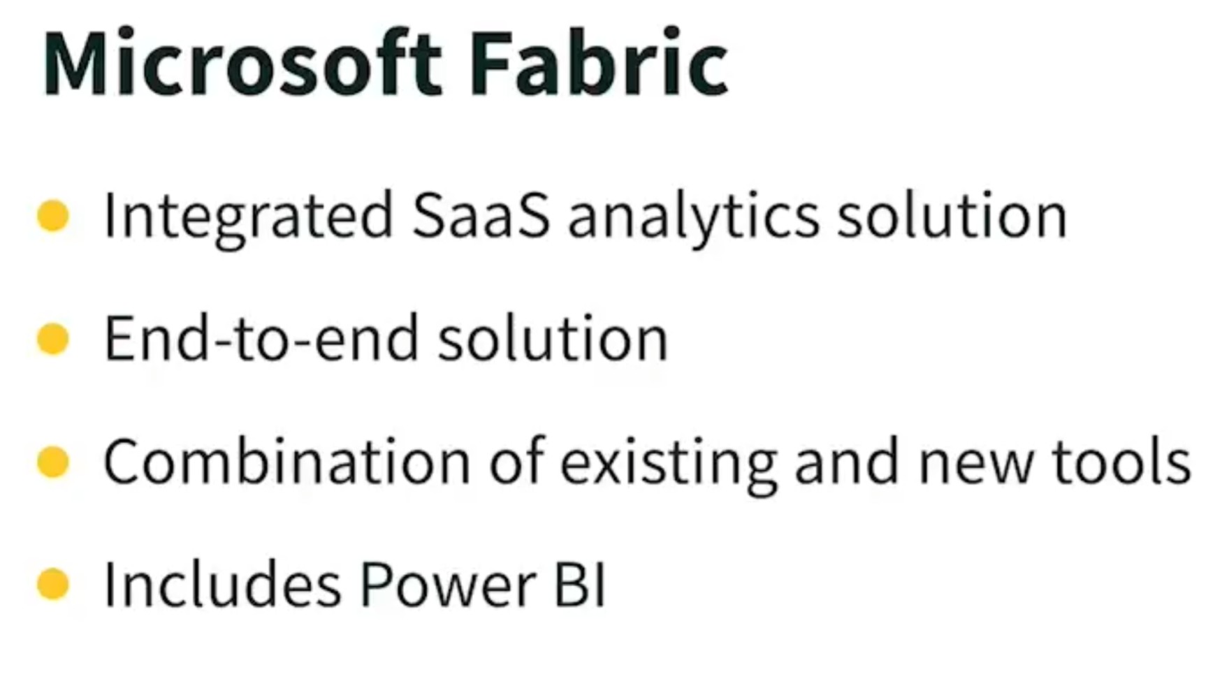
The two movies in this chapter highlight recent changes in the Power BI service due to the introduction of Microsoft Fabric. If you already are familiar with Power BI, these movies and some other movies that are new to the course might be all you want to do when you're coming back to look at the course again, but if you're new to Power BI, I still encourage you to view the movies so you're familiar with these concepts and recent changes to the Power BI user interface. Microsoft Fabric, which was released in 2023, is an integrated, cloud-based analytics solution that makes it easier for enterprise users to move store and analyze data. Fabric is an end-to-end solution that brings together existing tools, and also includes some new tools so that users have one single tool set to use when they're moving, storing, extracting, analyzing data. When you fire up Power BI, it's easy to know if you're working in Fabric. First, there'll be a Fabric logo that actually appears. Let me show you what that logo looks like. It's that logo that appeared briefly, but is now at the lower left-hand corner of your screen. Looks sort of like a stylized F, for Fabric, and that will appear as Power BI is loading. Beyond that, the Power BI icon in the lower left-hand corner has some other options, and that's new as well. We'll talk about that in a bit. But if you've previously worked in Power BI, everything that you had created in Power BI before Fabric is still here. Your workspaces, reports, dashboards, and datasets are right where you left them, but datasets are now called Semantic Models, because the word, dataset, means something else in Fabric.
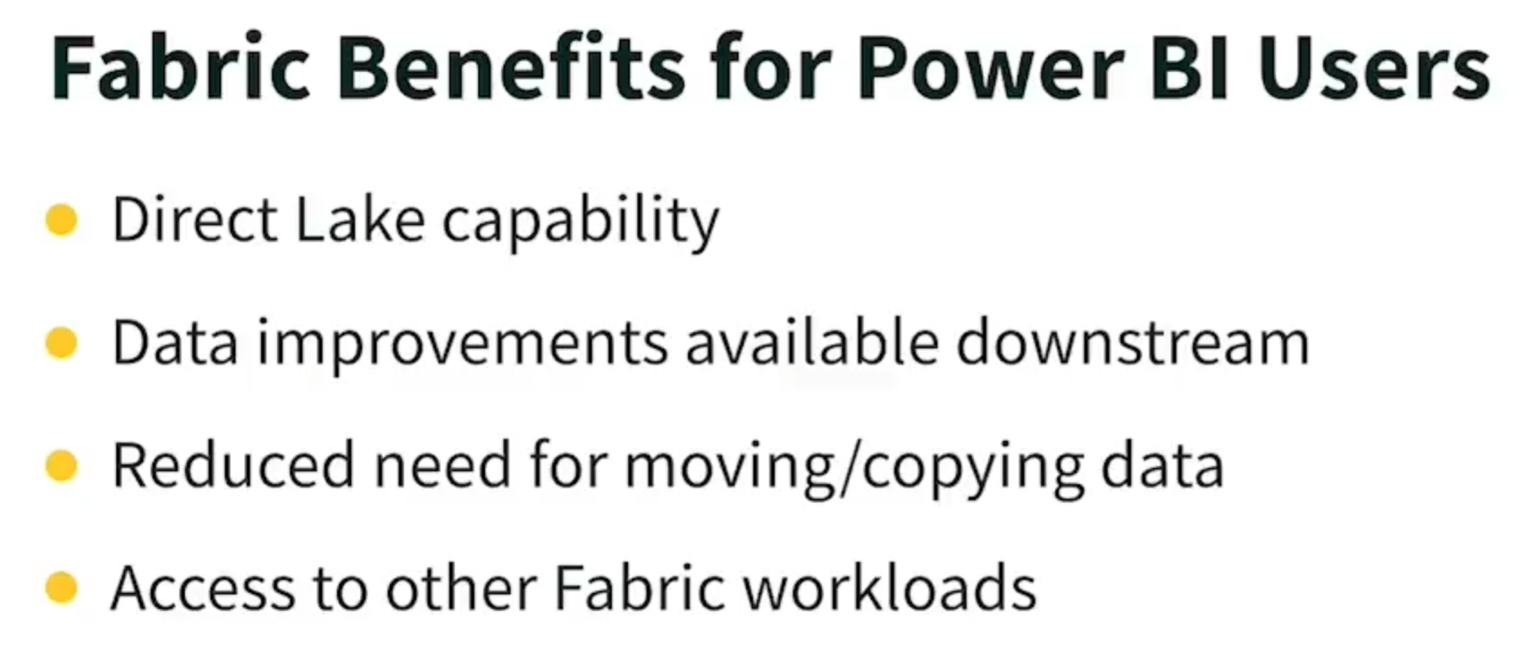
In Fabric, Power BI is used for all the same reasons you used Power BI without Fabric, for data analysis and visualization, and for creating reports and dashboards. Fabric has both direct and indirect benefits for Power BI users. If you use Power BI and Fabric, you can take advantage of the Direct Lake capability to directly access enterprise data. So, you'll see performance improvements with large reports and complex dashboards, and when data scientists and engineers improve the data that you're using, for example, by adding new columns of data, you'll be able to use these new columns without needing to connect to a different data source, or even reconnect to the data source you're already using. Data improvements made by others are available to you as a user downstream. This means there's a lot less need for moving and copying data, but if you have Power BI Premium, you also have access to other Fabric capabilities. As you expand your skills in Power BI, you might consider learning some of the other workloads, because they're going to be right there in the bottom left corner of your screen. Fabric gives us a single environment shared by our data professionals, and by the business, by end users. What that means is when data professionals make modifications to our data, these modifications are immediately available to us without a separate load event. The Fabric environment, as a whole, is optimized for different roles, so there are different ways that we access the data, but it's still one environment. This allows organizations to have centralized data governance and centralized security management. They set security once, and don't have to set it again in Power BI, for example. This should provide end-to-end ease of use, which hopefully yields reduced costs and an increased competitive advantage for the enterprises that are using all of Fabric, including Power BI. If you'd like to know more about the components of Fabric that aren't Microsoft Power BI, then check out "Learning Microsoft Fabric: a Data Analytics and Engineering Preview" in the LinkedIn Learning Library. Let's continue.
Chapter Quiz
Question 1:
Renata is a business analyst who spends significant time modeling and transforming data. Which Power BI tool, a free download software, will Renata most likely be using?
- a. Power BI Mobile
- b. Power BI Pro
- c. Power BI service
- d. Power BI Desktop
The correct answer is: d. Power BI Desktop.
The free Power BI Desktop download software enables an analyst to model and transform data.
Explanation:
Power BI Desktop is the free downloadable application designed for business analysts like Renata to model, transform, and visualize data. It’s the main tool used for developing Power BI reports before publishing them to the Power BI service.
- Power BI Mobile – Used to view dashboards on mobile devices.
- Power BI Pro – A paid license for sharing and collaboration in the Power BI service.
- Power BI service – A cloud-based platform for publishing, sharing, and collaborating on reports and dashboards.
Question 2:
You are trying to sign up for the free 60-day trial of Power BI Pro with your personal email, yourname@hotmail.com. Why won't you be able to sign up for the free trial?
- a. You do not have any Microsoft accounts connected to your email address.
- b. Your email address has to be a business email, not a Hotmail personal email address.
- c. You are currently using the free version of Power BI service, so you are not eligible for the trial.
- d. You included your name in the email address, and only an organization's name can be used.
The correct answer is: b. Your email address has to be a business email, not a Hotmail personal email address.
You can only use what Power BI recognizes as a business organizational email for the free trial.
Explanation:
To sign up for the Power BI Pro free 60-day trial, Microsoft requires a work or school email address. Personal email domains like Hotmail, Gmail, Yahoo, etc., are not allowed for Pro trials.
- a. Incorrect – Having a Microsoft account isn’t the issue here.
- c. Incorrect – You can be on the free version and still start a Pro trial (with a business email).
- d. Incorrect – Including your name is allowed; the issue is the domain (e.g., Hotmail).
Question 3:
What will you find in Favorites on your Power BI service home page?
- a. items you have set as favorites as well as dashboards and reports
- b. items you have set as favorites and workplaces you have created
- c. only items you have set as favorites
- d. items you have set as favorites, or have most recently used
The correct answer is: c. only items you have set as favorites
By setting an item as favorite, it will always appear at the top of your home page with items you have used frequently by count below.
Explanation:
The Favorites section on the Power BI service home page shows only the reports, dashboards, or apps that you manually marked as favorites by clicking the star icon. It does not include recently used items or all dashboards by default.
- a. Incorrect – It includes only items marked as favorites, not all dashboards/reports.
- b. Incorrect – Workspaces are not shown in Favorites.
- d. Incorrect – Recently used items are found in the “Recent” section, not Favorites.
Overview: Power BI data sources
Overview: Power BI data sources
This chapter focuses on how we get data so that we can analyze it and visualize it in Power BI. In the Power BI service, we can pick an existing semantic model, one that we've used previously or one that someone else has prepared for us. What used to be called datasets are now called semantic models in Power BI, but the labeling isn't consistent through the application. So when you hear or see the term dataset in Power BI or in this course, think semantic model going forward. We can load an app that will contain a semantic model, but will also contain a report and may contain other things as well. We can paste or even manually enter data. Obviously, we wouldn't want to do that with a large set of data. And finally, we can upload a Power BI file called a PBIX file, which will include a report and some data, and we upload that into our workspace. All other data sources, including even Microsoft Excel, require us to use Power BI Desktop, which we'll be exploring at the end of the course.
Use the Power BI data hub
Use the Power BI data hub
When I'm on the home page in Power BI and I scroll down, I see a list of all of the different types of objects I have in Power BI. I have a report here, for example. Scroll down a bit, I have a dashboard. I have semantic models, and semantic models are what we formerly called datasets, although the word dataset has a different use in Fabric, and therefore, we've renamed Power BI datasets semantic models. So this is a mix of all kinds of things that I have, that I can work with. I want to contrast that with the data hub. The data hub has been with us for a while, since Fabric. It's the OneLake data hub, and this allows you to look at really sources of data in your organization. So at across the top, I have some tiles of items that are recommended. I can scroll across. Really at this point, nothing's recommended. These are just my things that I've worked with lately. On the left hand side, I have my Explorer. I have items that I have quick access to, and then everything else, and all of these are workspaces. If you see a diamond next to it, it means that it's premium content under Power BI, as opposed to content that you don't need a premium license to use. So you'll notice I have this preview energy demo. And if I click on this, all of these items are coming to me from our organization's OneLake. And therefore, I have to have a premium license to access them. But I have other types of workspaces. I have a retail analysis workspace that has a model. And again, it's not going to show me reports or dashboards or anything. This is just showing me the places that I can connect to data. In my workspace, I have a number of places I can connect to data, each of them listed as a semantic model. A couple of other things that are new with Fabric. One of them is the ability to view data that you don't actually have permission to use yet. The idea here is that your organization may have a number of different semantic models that you could connect to, but if you don't know they're there, how do you even know that you might want to use them? And so there's a feature that your Power BI administrator can turn on, called Semantic Model Discoverability. And if they turn that on, then you can actually view items that have been endorsed, that are available, even though you can't connect to them now. But it lets you know that, if you had something here that was listed as endorsed, there's usually a way that you can have somebody give you permission to use that data. That's why they bothered endorsing it and making it discoverable. So if I want to just look at where is data that I can get to, that's what the Data Hub is for, here in Power BI. If I want to look at everything I have, I can either go home and scroll down this list, or I can browse to see all of the different items that I have.
Get existing content from an app
Get existing content from an app
Whether I want to use an app that was created by someone in my organization, or an app from an online service, I begin by clicking the Apps button in the navigation pane. I'll see the apps that I already have loaded into Power BI, and if I have a number of them, notice that I can filter them. I can also search if I wish, but I only have a couple, they're easier to see, and I'm going to click Get apps, to be able to view other apps that are available to me. The number of apps that you see may be limited by your organization, because your organization gets to curate the apps that they would like you to have access to. Here we have All apps that are available, Organizational apps, and an older style of app that is called a Template app. You can click on All apps and Search. You can also browse here if you wish, there are lots of apps. Some of them cost money, some of them are free. And the app that I want to look for is an app that is about the US Census, so I'm going to enter census, and here is our Census Data Map. It has two reviews, three stars out of five. I'm going to click to load information about this application. On the left-hand side, I noticed that this is a free app. You can read the developer's information. You'll see, for example, you'll see dashboards, reports, different options that they would like you to know about. Ratings and reviews are on a second tab. And if I decide I want to get this application, I simply click Get It Now. I need to confirm my details. In this case, this is how I am logged in. Note that I'm giving Microsoft permission to share or use some account information with the provider, Attadale Partners. Click, Get It Now again, and now Power BI is going to ask me the same question. Power BI says, "Do you really want to install this?" Because I was for a moment there in the App store, and now I'm back in Power BI, and I'm going to give permission to install. There's a banner that says this may take a little while, but this isn't a large app and it won't take that long. The app is added to my list of apps. Also noting when I downloaded this app, what version it was, and there was a banner here for a moment that said, go to the app. I didn't click on it while it was still there. There's Edit and Delete are my options, and if I want to Favorite this app, I would click right here, so that it's added to my Favorites list. I'm going to click the app title, which is a hyperlink, to load this application. This is how this app presents. At the top it says you're viewing this app with sample data. If you want to connect your own data source, there's a link that helps you to do that. On the left-hand side is the navigation. This is State Data, and then this is simply a Tooltip, but it looks like State Data is where we would like to spend our time. And we could work with this application if we wish. Now, if you have a few minutes, this is a really good time to browse the apps that are available. You can filter them by Apps. Remember how we got there. I'm going to click the Go Back button to return to the Apps page, and click Get apps to have access to all of the apps that your organization allows you to see. But if you were looking, for example, for sales applications, you, in Power BI, you could click, enter sales, and see a lot of different resources for sales applications. If you find some apps here that you might be interested in using in the future, this is a great time to note them, because you might forget to come back here. If you want to use the personal notebook set up in LinkedIn Learning, if you go to the Overview page for the course, between the Q&A tab and the Transcript tab, you will find a Notebook tab, and that is for your personal notes for this course.
Save files for use in Power BI
Save files for use in Power BI
If you are working along with me, and haven't yet downloaded the exercise files for this course, you're going to want to do that next. Go to the Overview page for the course. Click the Show All link, next to exercise files, and download the exercise file archive or zip file, the file that begins with ex_files. That file will now be in your downloads folder, but you can move it anywhere you wish. I dropped mine on the desktop. The archive file has a long name. I renamed mine PBI2022 X-files, and I suggest you do the same or something similar. After you've moved this archive, extract all the files. You can either right click and choose extract all from the shortcut menu, or double click on the archive to open it, and click the extract all button. Remember where the resulting folder is located. That's what you need to do. If you need to pause the video and download and extract the archive, do that now. Next, open your OneDrive for business and click the open folder button. We're going to store the files we just extracted in the cloud. I'm going to take the folder that I extracted, and I'm simply going to drag it and drop it in OneDrive, anywhere but in another folder. Here it is. So name it a name that works for you and put it in your OneDrive for business. We store our files that we want to use in Power BI somewhere in the cloud, because that makes them easily refreshable by Power BI, and it also means that you can have multiple people working on them. Think of it this way, if I was to connect to a data source that was on my local machine, I'd have to give Power BI permission to come crawl around on my desktop computer, to check and see if a file's been updated, so it could refresh data. I don't want Power BI to do that, and it would be a little scary if I could let it do that. And the most common places that you and I will store files would be in our OneDrive for Business, or somewhere in SharePoint, so that we can easily then have that file be updated. Files that we save in this way become automatically refreshable by Power BI Desktop, which we'll look at later in this course.
Create a new data set
Create a new data set
Creating a new data set on the fly is really pretty easy. What we're going to do is click the Create button and then choose the tile with the first option, "Paste or manually enter data." Now, I think pasting is a great idea, and manually entering very much data is a bad idea. So we're going to use some data that already exists. I'm going to go to my OneDrive for Business, to my exercise files, choose that I want the folder. And if you go into the Chapter 02 files, you're going to find a Word document called Lead List, and I'm going to open that document. Now, nobody would recommend Word as a data store. However, there's a plethora of tabular business data that's stored in tables in Microsoft Word, and it's the only place that it lives. That happened because there were people who were great Word users who weren't Excel users or weren't Access users. So they simply dumped their tabular data into Word. And that's totally inaccessible from Power BI, unless we go through this process. The first thing we're going to do is select the entire table. Don't drag, simply click the four headed arrow in the upper left hand corner, and then however you'd like, let's fire up a copy, Operation Control C, if you wish. The copy button, right click, use the menu. And now, we're going to swing back to Power BI. When we clicked the option to get data, the Power BI opened up Power Query. Now, you might have seen Power Query previously if you're an Excel user, but if not, you're going to spend a lot of time in Power Query in this course because Power BI uses it. I'm going to click in this very first cell, hold control and hit V to paste, and here comes my data flying in from Microsoft Word. The first thing I want to do is make sure I've defined it correctly. My Power Query detected delimiters in the data. In other words, the lines or the tabs in our tabular data. It could be that I had a list from someplace else that it detected it incorrectly, but this looks like my data. So I'm going to just close this banner. And then it says, do I want to use first row as headers? Well, my first row says company, first name, last name. Those are my headers. What happens if I don't do that? Then my headers will be column one, column two, and so on. So click Use First Row as Headers. So my first row has now been promoted to be my headers. In addition to detecting how my data was delimited and that the first row was special, and I might want to do something with it, another thing that Power Query automatically did for us was it assigned data types to the different columns. So if I click the button that says A, B, C, 1, 2, 3, what it shows me is I can choose a specific type of data for each of these columns. Now, in each of these columns that exist, the detection was that it should be any, or basically text-based data, or any or textbook could be numbers. What I want to look for in an address list is that zip code was not assigned to number, because zip codes in the United States sometimes starts with zeros, and the leading zero from a zip code in New England would be cut off if this wasn't any or text, but this looks good to me. That's fine. If I want to name this lower left hand corner, I'm going to double click and say that this is my lead list. That's it. And then to the right hand side, lower right hand corner, I have three options. Create a report from this data, create a blank report, or only create a data set. I'm going to click Create Data Set and let Power BI and Power Query churn on that for a second. A question for your consideration as you think about how Power BI gets used in your organization, do you have tabular data similar to this in Word or in any other application that this approach of copying and pasting it to create a data set would be useful for you in Power BI? If so, take a moment and make a note about that. If you wish, you can use the notebook that's contained in this course for your notes. And check it out. Here's our lead list with all of our information, a new table living here in Power BI.
Upload a PBIX (Power BI Desktop) file
Upload a PBIX (Power BI Desktop) file
There's one more way we can retrieve data into the Power BI service, and that is to upload a file that was created using Power BI Desktop. The file extension for Power BI Desktop files is .PBIX and people call them PBIX files. So we do this by first selecting the workspace we want to put it in and then uploading our data. I have a number of workspaces. I've been at this a little while, but you probably only have one, and it's called My Workspace, maybe even has your picture on it. But you would begin always by going to the appropriate workspace. Then what we're going to do is choose upload. You can bring in a PBIX file from OneDrive for Business or from SharePoint. And Power BI will also allow you to browse and go find one someplace else if you stored it elsewhere. But as you saw a couple of movies back, there's a compelling reason to be using OneDrive for Business or SharePoint, a cloud-based solution for your files. So I'm going to go to OneDrive for Business, go to our exercise files, the folder that we created previously. Sorry, mine's called PBI 2022 X files. Not sure what you named yours, but go there and we're going to drop down into chapter two files. And there is a singular PBIX file here, Retail Analysis Sample PBIX.pbix, and that seems like I stuttered a little bit. I included it in the name on purpose. Last year, by the way, I could also upload Excel files, but we can't do that anymore here. If we want to work with Excel, we're going to do that in Power BI Desktop. Click Upload and this is a little chunky, so it might take a little bit of time. And if you wish, you can always refresh. You don't need to, you can just be patient. But here I have my new file, and if I open up my PBIX file, it has an info page in the front. This is a newer, relatively newer version of this file, an overview page. All of these are report pages. All of these are editable, and you can actually visit the Semantic model behind this if you want to, because if you drop into Edit mode, here's your semantic model that has a number of different tables, lots of different information, and we'll be spending a considerable amount of time working with this particular model. But this is how we upload information that is coming to us from a PBIX file. It starts with a report, but that report will also give you access to your underlying data. While I'm here, I'm going to take a second and add this to my favorites because I'm going to be using this throughout the course.
Chapter Quiz
Question 1:
Which of these types of data sources cannot be used directly from the Power BI Service?
- a. Power BI Desktop file
- b. Excel workbook
- c. CSV file
- d. Access database
The correct answer is: d. Access database
Explanation:
Power BI Service (powerbi.com) can directly use cloud-based files like:
- Excel workbooks stored in OneDrive or SharePoint
- CSV files in the cloud
- Apps and semantic models already published
However, Access databases are on-premises by default (unless specially cloud-hosted), and therefore:
“All other data sources, including even Microsoft Excel, require us to use Power BI Desktop...”
“...a Power BI gateway [is] used to synchronize data coming into Power BI from enterprise systems on-premises.”
This tells us Power BI Service alone cannot directly access on-premises sources like an Access database — it requires Power BI Desktop and/or a data gateway to connect.
Question 2:
Why would you store Excel files in OneDrive for Business for use with Power BI?
- a. You cannot import Excel files like you can with CSV files.
- b. Excel files are more complex than CSV files.
- c. Your data source will not have to be formatted as tables.
- d. Excel files will be refreshable using OneDrive for Business.
The correct answer is: d. Excel files will be refreshable using OneDrive for Business
Explanation:
From the section "Save files for use in Power BI" in the PDF:
“We store our files that we want to use in Power BI somewhere in the cloud, because that makes them easily refreshable by Power BI... The most common places... would be in our OneDrive for Business, or somewhere in SharePoint.”
This means:
- If your Excel file is stored locally, Power BI can't auto-refresh it from the service.
- But if it's in OneDrive for Business, Power BI Service can refresh it automatically without needing to access your local computer.
Question 3:
You are uploading an Excel workbook. How do Excel workbooks differ from CSV files that you might upload?
- a. Excel files are all data from start to finish, without any titles.
- b. Excel workbooks are automatically refreshed wherever they are stored.
- c. Excel workbooks can contain multiple data tables.
- d. CSV files include titles, and can have more than one workbook.
The correct answer is: c. Excel workbooks can contain multiple data tables.
Explanation:
From the course’s data sources section and the workbook handling content, we know:
- Excel workbooks can have multiple sheets, multiple tables, and named ranges — meaning you can import multiple structured datasets from one workbook.
- In contrast, CSV files are flat files — they contain only a single table of data (one sheet, no structure, no formulas, no multiple tabs).
Overview: Visualizations
Overview: Visualizations
Now that we know how to get data, we can move on to creating reports, which are composed of visualizations. I'm going to scroll down on the Home tab to my retail analysis sample report and open it again, but this time I want to open it in Edit mode. You'll find the button here on the top above the report. Before you Click edit, I want to point out that the default mode, when you open a Power BI app is the "Reading View." Now Click Edit, and this is what the report editor looks like in Power BI. Our fields list loads (which on the lastest version of Power BI, "Fields List" has had its name changed to "Data." Here is where you will see all of the tables loaded into the PBIX file), and also the visualizations gallery right here, which is really rich. What all of the visualizations in this report on all four pages have in common is that they are all based on this same data set right here. You and I can create reports from scratch. We can edit reports that already exist, and we can modify and manipulate the visualizations and existing reports. So it's useful to know what visualizations exist and what's possible with them. We see a number of visualizations in this report, many of which are familiar from Excel, but there are even more visualizations that are available in the gallery. Let me briefly describe them to you.
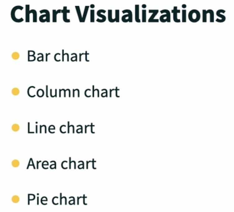
First, we have the chart visualizations, charts in the traditional sense of the word, bar charts, column charts, line charts, area charts, which are just filled in line charts, and pie charts. Hopefully you are familiar with all of these, because despite the fact that one of them is named pie, these types of charts are the bread and butter of chart visualizations. We then have some slightly more esoteric charts, but we also have access to many of these in Excel.
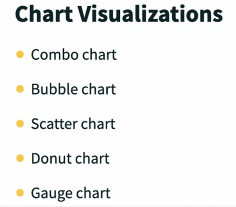
For example, combo charts, which are combinations of two chart types, a line and bar, for example. Bubble charts, scatter charts, donut charts and gauges, which display a part of the hole like the gas gauge in your car.
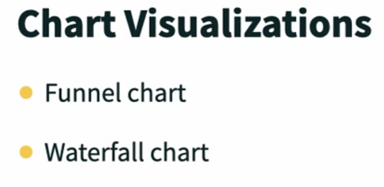
Funnel charts are used to show time or expenditures for different phases of a project, or can be used to display a pipeline, like a sales pipeline. Waterfall charts are used to show changes such as a variance over time.
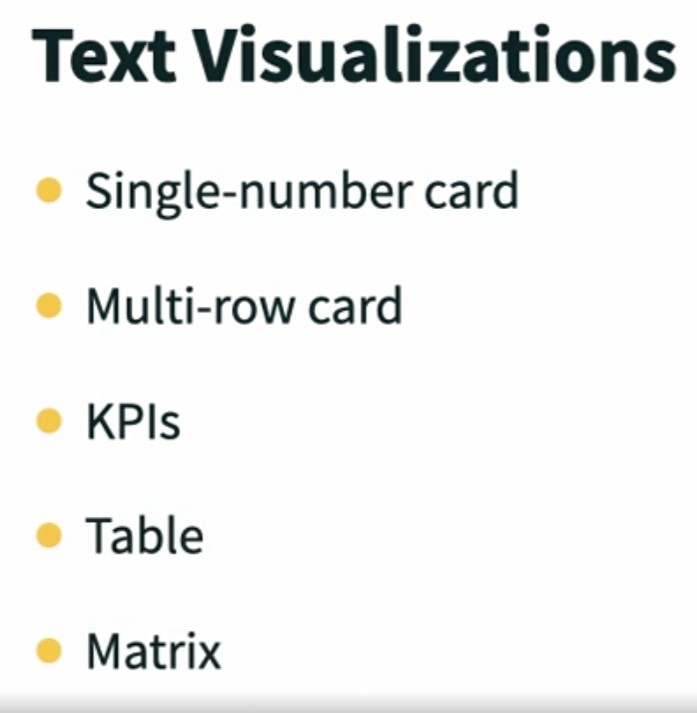
Then we have text visualizations. A single number card usually called a big number card, is a card that simply has one number in the middle of it, but we also have multi row cards that allow us to show details for a row or a record. KPI visualizations are used to display key performance indicators, data where we have both values and goals. Tables and matrix visualizations are both used to present tabular data, and they both look a lot like sections of an Excel spreadsheet.
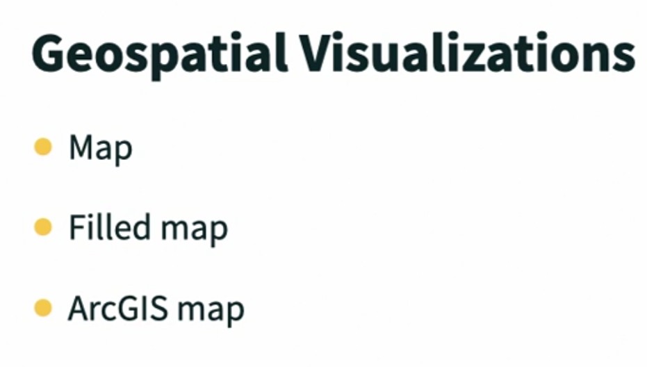
Geospatial visualizations represent data points as pins in a map or a filled map where the intensity of a color shows something about the contribution in that area. For example, sales by state. Filled maps are almost always used for recognizable geographic areas, states or counties or countries, because if you don't understand the shape that is being filled in, visualization isn't very useful. ArcGIS maps are used for embedded location-based analytics. Every one of these geospatial visualizations requires geospatial data. For example, you can use latitude and longitude or zip codes and address data.
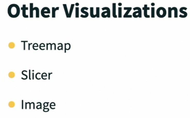
There are other visualizations as well. A tree map, for example, which isn't actually a map. A tree map displays hierarchical data using nested rectangles. A more useful three-dimensional version of a pie chart. Slicers are used in Power BI as they're used in Excel, with tables and pivot tables. They provide a visible filter, and although almost all of the visualizations we've talked about can be used as a filter, slicers are a clear invitation to users to filter a page. And you can also use an image as a visual, go figure. These are the major built-in visualizations.
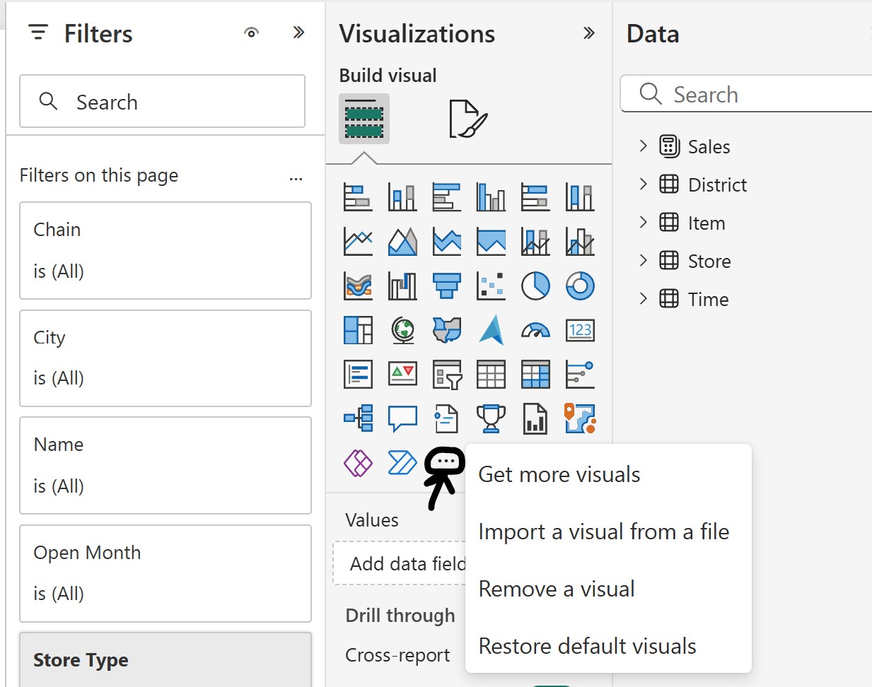
We can also add custom visualizations using the Get more visuals button in our gallery.
With Power BI, we combine these visualizations to tell a story. On this page of the report, for example, the story about new stores within our sales organization. When we're ready to share parts of that story with others, we have a couple of choices. One is to create an app workspace and share the report with the dataset and anything else that our colleagues need so they can collaborate, and they can edit it as well.
The more traditional choice is to take one or more of the visualizations from this report and perhaps visualizations from other reports as well, and pin them on a dashboard, and then share that dashboard more broadly.
With so many great visualizations available, often you will need to focus most on choosing the visualization that best tells your data story.
Work with visualizations in a report
Work with visualizations in a report
Let's now open the PBIX file that we loaded in the last chapter. I'm on the homepage. I'm going to enter PBIX, which was included in its name as well as in its extension. And you'll see that I have two items. I have a dashboard, which we'll look at perhaps later, but I want to start with the report, which is right here. So simply click, and the report opens. Don't worry that it doesn't look like much yet. This report has also been changed recently. And so we have an info page where we didn't use to have one, and there's a page missing that was included in the original report. But our page tabs are right here. You can collapse this if you want to, you can expand it to show it again, but let's leave that info page and go to the overview where we'll see, the first page of the report has four visualizations, four different charts. Pie chart, column chart with legend, map. And then here on the right we have a bubble chart, which is pretty slick. So the question is how do we use these visualizations? How do they work together? Why are Power BI reports considered to be so relentlessly useful? Well, let's look at the district monthly sales page of the report. This is organized, and it's a very cramped report. Don't let that bother you. It's in part because we have not just page tabs, but we have a toolbar at the top. We have some filters on the right. If we want to collapse that Filter pane, we can click the Show/Hide button and win a little more room back. On the left-hand side, we have a visual that's showing us a list of district managers. We can scroll this, and all of their names are here. Alphabetized list. We have sales by store number. That's what's on the x-axis here. We have total sales variance. There are titles for each of these visualizations. This one's last year's sales, and this year's sales by fiscal month and, here, variance as well in this bubble chart. What if I only wanted to look at Brad Sutton's information? If I click Brad Sutton's name in the district manager list, click this checkbox, the entire page is redrafted. Every visualization now simply shows me Brad Sutton's information. That means Brad or Brad's manager can see Brad's information. It means that Chris Gray can see her information. It means that Valerie and Tina can see their information. This is really slick. And by default, in this type of a list, I can hold Control and do multi-select to see, for example, the results for Brad, Chris, and Valerie who are all on the same team. I don't have to generate a separate report to do this. I just filter the report that I already have. To turn this filter off, simply click on anything else, any unselected item if you wish, and the report comes back. Or if you're not sure and you want to reset the entire report, you can click this Reset Filters, Slicers, and Other Data View Changes and click Reset, and the report will come back as it was when it was loaded. Let's swing to the New Stores page of the report because there are a couple of things I want to show you here as well. The same interactivity between the visualizations is true here, and this is something that you can set. You might choose to have a visualization that you don't want users to use as a filter, but out of the box, so to speak, this is how Power BI visualizations work in relationship to each other. So if I would like to look at information just for the month, for example, of January, I can select January in the column chart and see just January information or just January for a particular chain. There are two different chains here. Or just take a look at Fashion Direct in a particular month and notice that, once again, when I am selecting data in one chart, it is filtering my other chart sometimes by highlighting something, sometimes by hiding other data or modifying it. And if I wish, I can click in the background of the chart as another way to quickly reset the entire visualization and therefore the entire page. I can also use some data. For example, I could choose to use just a set of stores. I could rope in a set of data, drag to choose a set of items here, for example. And I can use those selected items to filter the other items on the page. So you're not limited to clicking on just one item. You can actually lasso items and use them as a filter. And, again, remember that you can click somewhere in the background then to clear the filter and reset it. The filters that I apply here using this report are temporary. I'll show you later how, as a report designer, you can build more persistent filters, either filters you want your users to be able to change or that you want them not to be able to change. One more thought before we leave here, to be able to edit anything in this report or any other report, we're seeing it now in what's called a Reading View, but if I click that pencil, I end up here with tools that allow me to modify visualizations and work directly with the data. To go back to that User View, Click Reading View again, and we fly back here into Power BI Reading View. So Edit and Reading View get us in and out of the Power BI Report Editor (Recap: The default view when you open a Power BI app is "Reading View" - to edit you click on "Edit").
Create a new report
Work Create a new report
There are two primary ways we'll create a new report in the Power BI service. We can either create a report by starting with a copy of an existing report, or we can create a new report from scratch. (Note: Remember we are working right now in Power BI Service which is the web based platform, not Power BI Desktop. When using Power BI desktop, processes are different). To create a copy of an existing report that we can then modify, open the report, go to file, choose save a copy, provide a new unique name for your report, choose a workspace, click save, and you'll have a report that you can modify. So if there's a lot of overlap between the report that exists and the report that you want to design, this is a running start.
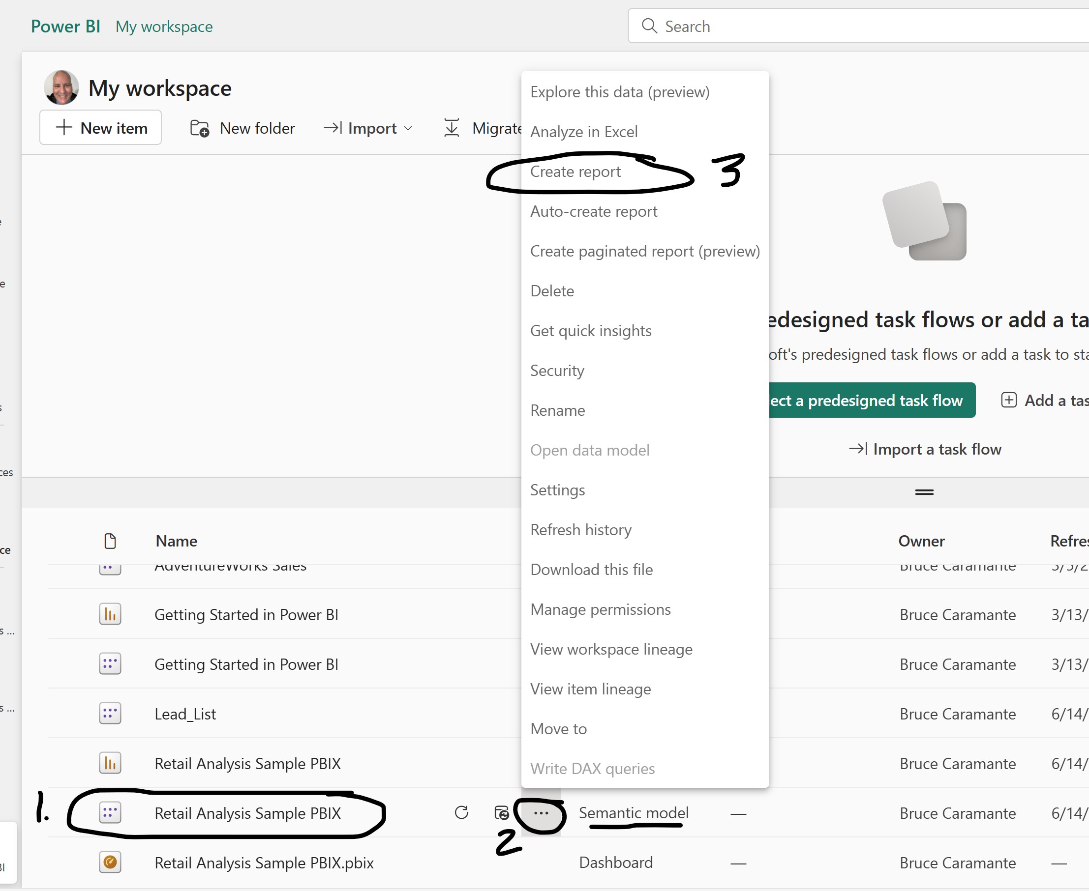
The second option is to start from scratch. I'm going to go to my workspace and I want to go to my data set, not the report. And if I point to the retail analysis sample and click the more options button, one of my choices is to create a report. There are other places that you will see a button that says create report, and if you don't have a dataset selected, you'll then be prompted to select a dataset. But I like going to the dataset and then creating a report.
NOTE: There is a change in the latest version of Power BI (6/19/2025)
Old Power BI UI (instructor’s version):
- The icon of a database represented a Data source (or dataset).
- You could create a report directly from the dataset by clicking on it.
New Power BI UI (2024+):
- The "Data" icon is now labeled as "Semantic Model".
- This is functionally the same thing as the old "dataset" — just rebranded.
- Microsoft updated the naming to reflect that it’s a tabular model with relationships, measures, and metadata — not just raw data.
So to answer your question:
“If I want to create a blank report, do I go to the PBIX file where the type is a 'Semantic Model'?”
Yes.
Open the Semantic Model in your Power BI workspace.
Click the “Create report” button (or “+ New report” depending on UI).
This will launch a new report canvas connected to that model — just like in the older version when you'd open a dataset.
Summary:
| Old UI (Instructor's) |
New UI (Your version) |
Meaning |
| "Data" or "Dataset" |
"Semantic Model" |
A data model published to workspace |
| "Create report from data" |
"Create report from model" |
Same action, just renamed |
How to create a report from the latest version of Power BI
Instructions: In this example you are locating the "Retail Analysis Sample PBIX" with the Type being the "Semantic model." then you click on the three dots and the menu will pop up. Select "Create report."
Here is my new report canvas, and we are in the report editor. I have a filters pane, a visualizations pane, and a fields pane here on the right. At the top, I have options that allow me to save a report, save a copy of the report, print the current page of the report. Some view choices. Right now the view is fit to page, with smart guides on and many other options off. I actually like grid lines, so I could turn those on if I wish. Snap to grid, I can turn that on as well. And these are options that you'll change based on how you like to work with objects on a canvas. At the bottom, we have page tabs. This is page one, which I can double click to rename, and I use the plus button to add other pages here. From the dataset itself, which is already loaded, a new report is just a few clicks away. There is a third way to create a report, and that is to use Power BI Desktop, which we will be talking about later in the course. But in the Power BI service, whether you begin by copying and editing an existing report or starting with your dataset and then adding fields to create visualizations, either of these methods will give you a report that you can save and use in Power BI.
Create and arrange visualizations
Create and arrange visualizations
Here's the new report we've created page one, and we are going to add some visualizations. First, I'd like to add a list of district managers, and if I open district, here's the district manager. I can tell that this is information about a person because we have a contact card icon here, and I'll click district manager and Power BI will make a choice about how this should be displayed. And the choice that it's making is ah text. I will present this as a table. How do I know it's a table? Because if this visualization is selected, the visualization type is also selected here in the visualizations gallery. And if I point, it tells me it's a table. That's pretty cool.
NOTE: So, the first thing that I did was select the "DM" from the "District" table in the "Data" section. After selected you will immediately see the table appear on the canvas. Also, you will see that the "Table" icon in the "Visualizations" section is emphasized popping outward.
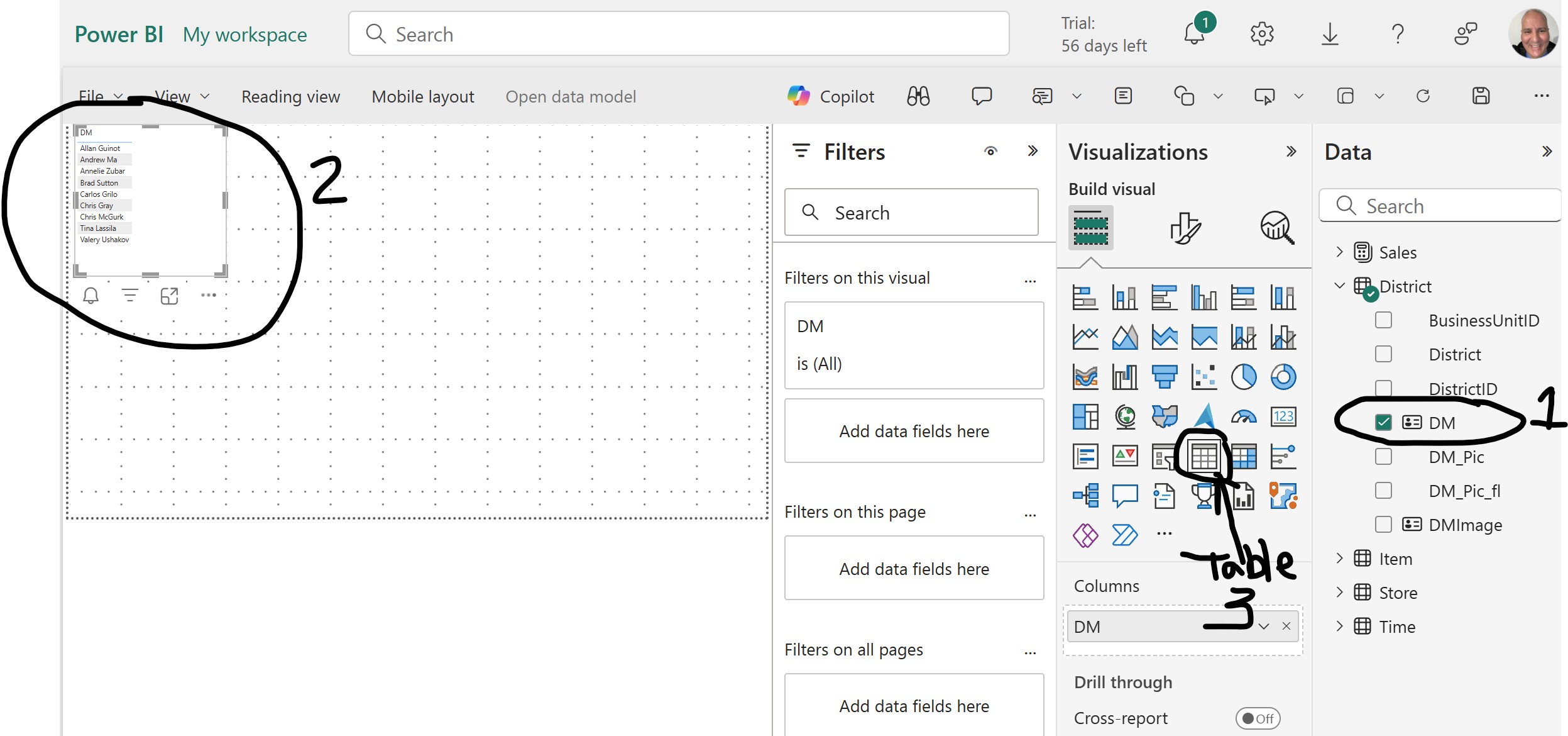
NOTE: So, the first thing that I did was select the "DM" from the "District" table in the "Data" section (1). After selected you will immediately see the table appear on the canvas (2). Also, you will see that the "Table" icon in the "Visualizations" section is emphasized popping outward (3).
Now, if I were to choose a different visualization type here, it would change this visualization. I don't want to do that. I'm going to click in the canvas, which unselect the existing visualization, and I'm going to add a new visualization. Let me show you a different way to create one. I'm going to click on the map visualization, which has a globe is its icon, and there's a map. Now with the map selected, I want to add some items to it. And I'm looking for geospatial data. When I'm using the mapping visualizations. I can tell that I have geospatial data because there's a small globe icon in front of it. And what I want to choose in this particular instance is postal code. So with the visualization selected, I click postal code and my visualization is populated with the data from the postal code field in the store table. Let's add one more visualization. Remember, if you don't want to change the type, click in the canvas. The third thing I'd like to add is information about sales. And so I'm going to open the sales table and I would like to find total units that were sold this year. So there's this year's sales, total unit sold this year. If I don't want to give up more space here, which I can, but notice it makes my canvas smaller, but that's the only way I can see all of these field names. But to see a specific field name, just point to it and you'll get a popup that will show you the total name, the full name. So I'm going to choose total units this year and its numbers. So I was presented with a chart. Okay, that's fine. We'll work with what we have. A report page will almost always have multiple visualizations, so we want to learn how to deal with arranging them. The first is you can select any visualization and move it. Remember that I turned the grid lines on, those are the dots, but the guidelines were on by default, and this allows me to line things up in terms of centering them for example. I'm going to give the map a lot of room, so I'm going to select the map, grab its frame, move it up here, and then click on it and resize it by grabbing a corner handle and dragging it out. That looks good. Now we'll drag our list of district managers up here, and if I want them aligned at the top in the same way, even though this doesn't look like it aligns 'em at the top, it will because when I click, notice that the top edges of them are aligned and total units this year, we'll just drag over here and align it at the top also. That works. This single column chart visualization doesn't do a lot for me. I want to change the type of this visualization. So I'm going to select it and I am going to point to card and simply click. And this gives me what we call a big number card, one number with the field name underneath it. That's it. If I would like these two visualizations to be roughly the same size, I can position them at least temporarily, one above another, and make sure that they're the same width, which they are. That gives me a little more running room for my map. I'm going to take advantage of it. I like the way this looks, so I'm going to stop here and in the next movie, we'll be formatting some of our visualizations.
Save and format a visualization
Save and format a visualization
We haven't saved this report yet, so this is a great thing to do now, before we lose any of our work, we'll feel a little less at risk. I can either choose File, Save, or I have a save button over here on the right as well. And we enter a name for our report, and I'm going to call this My Retail Analysis, save it in My workspace, and we are now saved and it switches me into view mode so that I can see a view. That's nice. I want to go back to edit mode though. I'm not going to be using filters for a bit, so I'm going to collapse the filters pane to give me a little more room so that everything looks larger. That'll make it a little easier for formatting, but I also want to point out that we have a canvas zoom control here at the bottom so we can zoom in and out and look at things. It's always good to be able to take it back to fit to page because that shows me how it's going to look when it's displayed for a user. But if I switch to reading View, and I'm going to save any changes to my report, I'll be prompted to do that whenever I go to reading View, notice that in reading view, our users also have a canvas Zoom that they can use. I'll slide back to edit, and I'm going to zoom out just a little bit and fit it to the page. All of the visualizations have some common attributes. For example, they have the ability to place a title at the top of them. They have a location and a size on the page, but then there are other elements that are specific to a particular visualization. Let's start with our table of district managers here. I'm going to slide it over to the right a little bit just because that pleases me. And the overwhelming problem that I have with this visualization is the print is just too small. How do I fix that? Well, with the visualization selected, we have some choices here at the top. We have a formatting button that allows us to format our visual. And these are the General settings. What are its properties? Where does it live on the page? How big is it? Does it have a title? And if I turn the title on for this, I can then add a title. Now, currently you might think there's a title here, but it's not, it's really just the column heading. So I'm going to type the word TITLE so that you can see where that would appear, here at the top. Typically, a one column table doesn't need to have a title unless there's a design reason to do that. The design reason might be that all of the visualizations have a common color for the title, like blue, and you want those to stand out. But in this case, with only one column, I'm simply going to turn that off. But remember that every visualization can have a title. We have some effects of what the background color looks like. Does it have a visual border? Is there a shadow? And if you turn those elements on, what you'll see is you get a drop shadow and at any point you can reset to the default and go right back to where you were. Are there header icons? Does this visualization have tool tips? These general formatting options and properties are available for almost every visualization. But on the Visual tab, I have formatting choices that are specific to this visual. I have some Style presets. This is the Default preset, but I could use something like Flashy rows and Alternating rows or Bold header flashy rows. You can always return and go back to the default. I can choose to turn the grid off, it is on right now. I can choose how values would be formatted, which I think is pretty cool because I might want to spin up the values. And when I change this to a 16 point, this is looking pretty good, actually, a 14 is probably good enough, but I'll need to resize this to give our list at least a little more room. You might add more than your current list needs because if district managers are added, you don't want to have to change all of your reports that include a district manager visualization table. I can change the text color, I can change the background color behind the values. These are all based on my themes, so if I wanted to put like a light yellow wash, here behind my values, notice the ones that aren't shaded in gray are yellow. That makes it perhaps even easier to read. I'll return this to white. I can change the size of the column header, which I should do, make that a 14 also, District Manager. And I can change all of these attributes of my column header. There's not much here you can't touch, and you'll note that you can provide specific formatting for totals, specific columns, cell elements, and so on. But the elements that I wanted to touch are here at the top, and that works for me. Now let's check out the map. When I click on my map visualization, same basic General list, does it have a title? It does. The title's on. Right now the title says PostalCode. Actually, these are store locations, so I'm going to enter that. This is currently styled as a Heading 3, if I want to change the size of the heading, I can do that. That looks good. If I want it to stand out a little more, I could change its text color. Remember I have the same types of effects, visual borders and shadows, Tooltips, Alt text. All looks good. Finally, I have my card, which is often called a big number card 'cause that's what we have, a big number. And for my big number card, I have very few formatting elements. On the General list, my regular list of properties, but the Visual I have Callout value, here, if I wanted to make that big number even bigger, I can spin it up. And the other thing I have is the Category label, which says Total Units This Year. And if I want to make that larger, I could, and if I wanted to bold it, I could, so it jumps out a little more. The current color that's being used for this is a gray scale color. I could change the underlying color to a blue. That would sort of reflect the blue over here in my map. As you begin formatting visualizations in Report, pay attention to what's available on the General tab for visualizations, because those are the things that you can make the same in different visualizations, in terms of colors, in terms of font choices, so that your report looks very consistent. Then you can modify the formatting for the specific visual that is selected.
Enable interactive transcripts
Enable interactive transcripts
We're going to create a couple of charts and I want to create some new space for those charts. So I will click the new page button. We get page two, and another blank canvas. Let's begin by choosing fields. In the Fields list I'm going to expand the Item table and choose Category. And Power BI is going to look at the data in that column, say, "All looks like text to me," and it will therefore choose a table as our visualization. And now I'd like to choose information about this year and the prior year sales, and I'll find that in the Sales table. And so I'm going to open up Sales and choose Total Units Last Year and Total Units This Year. And they are added to the table, and there's a scroll bar, which means I don't have enough space to display everything in this visualization. Let's give it a little more running room. If you'd like to see what that looks like, I'm going to just zoom in on that for a second so that you can see how it looks. Category, Total Units Last Year, Total Units This Year. That looks good. I'm not going to spend a lot of time formatting this. And the reason I'm not is I want to change the data type on this right away. I'm going to choose a line chart. And there are the prior two year sales, each its own data series by category. But this isn't time that's trending here. This is simply category. These are arranged from the largest to the smallest sales figure. What I want to do is show the contribution of each year, so I could basically look at two year sales together. And the appropriate chart for that is going to be a stacked column chart or a stacked bar. So I'm going to choose here, Stacked column chart on the top row. And this is what that looks like now. Stacked bar looks like this. Wow, I like that even better. But notice a scroll bar again, so we could give ourselves a little more room if we didn't want our users to have to scroll. Total Units Last Year, Total Units This Year. There's our two years of sales. That looks good. You know how to format this chart. With the visualization selected, click on Format your visual, and here are our general options, and the options specific to this visual. That looks good. Now, remember that you can change the view at any time. So if I'd like this to fit to the width, I have more space immediately for working. If I want to fit my canvas to the page, that gives me more room. If I want to show it actual size, that's 100%. But that requires me to scroll in my canvas as I continue building my report page. So typically I will choose either fit to page or fit to width. Now what we're going to do is we're going to create another visualization based on this visualization. I'm going to select it, Control+C to copy, Control+V to paste, and it dumped my second visualization on top of the first. And I will just pull that over here, just like this. And now I can change anything I want to about this second visualization. So currently we are looking at our sales last year and this year by category. Perhaps I don't want to look at both years. Maybe I want to just look at this year's sales. So the easiest thing to do, from my point of view, two options. One is total units last year. I can either go to my Build Visual List and get rid of total units last year. That's one option. If I want to undo that, Control+Z works just fine. Or I can uncheck it in my fields list. Either one of those gets me Units This Year by category. Now what I want to do is change this. So it's not about category anymore. I want to change it so it is about segment, or family name, or buyer. All of those look pretty weird, right? There's our list by buyer. What I'd like to do now is change the type of this visualization. I'm going to change it into one of my favorites, which is called a tree map. A tree map is like a pie chart, but made with rectangles. You might wonder, why would we do that? Well, I'm going to look at the pie chart, and do you see how difficult it is to tell the sizes of those wedges? No matter how big we make this pie chart, there are so many wedges, and it's hard for the human brain to actually compare wedge size. This wedge and this wedge. Is there a big difference between them? Actually, there is. This one's 50% larger, but it's hard to tell. But when I change that to a tree map, we are much better at being able to compare rectangles and size with each other. So I have two different charts. One of them a traditional chart that we would be used to from Excel. And again, because it has a scroll bar, I'm going to make this visualization a little larger to eliminate it, showing the entire visualization. I'm also going to resize this visualization so that they are the same size. Before we leave Charts and move on to other visualization types, I'd like to first note that the visualization gallery has three rows of chart types. You'll want to take a moment and get familiar with all of these so you know what types of charts you have access to, from our stacked bar chart, all the way down to our tree map. Next, I want to make a pitch for the difference between what we are doing, which is learning Power BI, and actually using Power BI. This data set that we're using in this fields list on the right, it's not my data. It's not your data. But when you begin working in Power BI with your own organizational data, something close to miraculous happens. The entire work of Power BI will get much easier. I mean, it certainly gets more intriguing because you have something at stake. You're building things at work. But you also have business expertise, data expertise. If everything that you're doing now feels a little remote, don't let that bother you. Like learning about Excel pivot tables, working with Power BI becomes easier the closer you are to the data that you're working with, and the more relevant that data is to you and your organization.
Use text and map visualizations
Use text and map visualizations
Let's add a third page to our report. So we have some space for visualizations-focused on territories. I'm actually going to double click the page tab and call this territories. You'll rename the other pages in a bit. I'm going to go to my field list to store and expand it and choose territory. And when I do, I get a map. But what if I wanted to have a table instead? Well, I could either change it to a table or check this out. If I start by creating a table and then I choose territory with my table visual selected. Notice that I get my list of territories in the table because I'd already selected that particular visualization. I want to do some minimal formatting here just because I would like my values to be larger. I like to be in the range of about 12 or 13 on these. That's my personal choice. You can make other choices and I don't need all this width. There's my list of territories. Now I want to create a map. So clicking on the canvas, choose territory. Sure enough, you're going to get a map and this is our list of territories. Let's give it a little more space by dragging right here. That looks good. We know how this operates too. If I click, for example, Maryland, I get one choice there, so on from my list of territories. Great. Now there's another type of map that you might be interested in to the right in the gallery that's called a filled map. And when I choose filled map, that is actually exactly what I get. I get a fill or an overlay that shows each of these territories in total on the map. So if I choose one territory, it'll drop back to that single territory. But with all territories selected, I get an overlay. Michigan, Ohio border, Georgia, Florida border. Almost a good name four band. And I'm working my way up to my favorite type of map, which is called an ArcGIS map. And it appears in the bottom row and doesn't really look like a map button, but it is. And with my map selected, if I click this map button, you would think that it would change right over to a ArcGIS map. And that would be nice, but it doesn't. What it does is it says we need to contact the contents owner for access. Don't even bother with this. Learn more link. Let me show you how we get around this. I'm simply going to delete my existing map and not try to switch from an existing visualization to ArcGIS. With no visualization selected. I'm going to choose an ArcGIS map, and I get a little bit more runaround. It says sign into ArcGIS. Don't get caught up in what's at the top here, okay? This is to make it easier for people who use ArcGIS all the time to be able to log in and access their ArcGIS data at their organization. It's not meant for you and me. We're not using ArcGIS with ArcGIS online or enterprise data. We're using it with another data set. The OR says just add location-based data to the location field well. Where do they mean? Right here. And the data that I want to select is City. We know it's geospatial because of the icon. So under store in City, I'm going to click, give it a second. And the City data is being added to ArcGIS. Notice a dot for each and every one of our stores, which is pretty slick. The other way I could have done this was to drag it into the well to choose city and drag it right here into location. And that works equally-well. I don't know about you, but I love map visualizations. They're compelling for our users. They're easy for them to understand. So pause for a moment now and consider what types of geospatial data you can readily access in your organization? And what types of users would find map visualizations helpful and useful?
Create a gauge visualization
Create a gauge visualization
Gauges are often used to indicate performance against a goal. For example, the gas gauge in my truck tells me whether my tank is 100% full or half full or quarter full. In business, those types of measurements are often described as key performance indicators. So we're going to add a gauge to our Territories page. The gauge is found on the same row as our maps, and it comes in right there, not necessarily where I want it. Notice there's a lot of white space around this gauge, but as I slide it up the page and resize it, now the gauge will actually fill the page a little more, which I like. Let's see if we can get that lined up. There we go. Now, when you're looking for key performance indicators in your data, look for the icon that you see here for This Year Sales. It's a line that shows, for example, a line chart, ever upward. Expand that, and you'll see a value, a goal, and a status. I want to start with my gauge selected by choosing Value. And there is the 22 million. And then I'm going to choose... And notice, that value was dropped into the value well here in the visualization. I'm going to choose Goal, and immediately something's wrong, and that's because the next open well was for Minimum value, but I actually want to put this probably as Target value. And when I do, it draws that as a line, but this isn't quite what I had imagined. What does this 44 million have to do with? The answer is basically nothing right now. So I'm going to move this from Target value to Maximum value. I've now set my maximum value at 23 million, which is This Year Sales Goal. And I can see that there's a little bit of a shortage here. I'd like to find some way to describe that. I'm going to do a little bit of formatting, and I'm going to open up Gauge axis. I have some choices there. Colors, and the color that I want to change is the Target color. And I'm actually going to change that to a brick red. It's like, wow, why is nothing happening? Well, the reason is, I didn't drop Goal in the Target well. I dropped it in the Maximum well to get my chart in the shape that I'd like it to be in, to make the chart operate basically like a gas gauge. But what I'm going to do then is return to Build visual, and I'm using this year's goal as my maximum value. I'm going to drag it again and drop it in Target value. And there we go. Now I have a target value that I can actually format red if I wish, and that looks good. Now, how does the whole thing work? Well, if I choose, for example, Georgia as a territory, we have our map and our gauge both reflecting the information from Georgia. Their total sales goal is 752,000, but they've sold 712,000. West Virginia, Virginia, Pennsylvania. For each territory, we can see their goal. We can see the location of their stores. We can see how much more they have to sell. Now, there are a number of things that could be done to better format this particular page. For example, I might like to use the same colors in the ArcGIS visualization for city locations as I'm using for either the target, or in this case, for our progress or value towards goal. I have some titles that I would like to change. My visualizations that I've selected, I think are the visualizations that I want to use, but I might like to do more to make this page look better. At this point, if you have time, I'd invite you to take five or 10 minutes and format these three visualizations so that they meet your design requirements. Please don't change the type of any of the visualizations, because when we return to this page later, I'll count on us having a table, an ArcGIS map, and a gauge. But other than that, I invite you to spend some creative time working with the formatting tools with the visualizations on their Territories page in our report. When you're done, save your report again.